Real-time Dashboards, Dynamic Reports and more
Manufacturing Data Visualization
By strategically visualizing production data, manufacturers can monitor their processes in real time and make swift, data-driven decisions. We take a look at different ways to visualize manufacturing data for maximum transparency.
Introduction
Making production transparent through data visualization
The numerous devices and systems in a manufacturing environment serve as sources of valuable data: Sensors capture process variables and environmental conditions while programmable logic controllers provide production volumes, status updates, and error codes. At higher levels, MES software manages operations, quality, and material data close to production, while ERP systems supply a wide range of order, workforce, and planning data.
But as data collection and connectivity capabilities increase, so does the competitive pressure to put this data to productive use.
This is where data visualization comes in: Displaying production data in real-time dashboards not only enables constant monitoring but also empowers data-driven and therefore better decision-making.
Effective data visualization requires the collection of machine data, often from different types of machines.
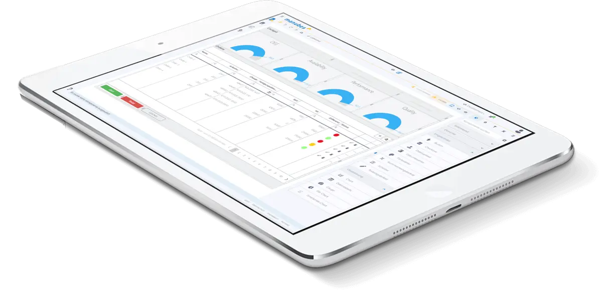
Benefits
What problems does data visualization solve?
A lack of real-time data poses several challenges for manufacturing companies:
1) In production monitoring, performance losses, disruptions and other issues are detected too late. Preventive measures are not possible without early warning and responses to acute problems are slowed down.
2) Without up-to-date data, it is difficult to optimize machine runtimes, material usage and work assignments. This results in higher operating costs and avoidable downtime.
3) Decision-making is slow or based on insufficient information.
4) Manual preparation of data (such as reports or presentations) is time-consuming and prone to errors.
5) Delivery dates, quality standards and production progress cannot be communicated reliably, undermining trust and collaboration.
The solution is to capture data automatically and in real time, forward it to relevant systems and visualize it appropriately. Equally important is ensuring accessibility – ideally, different teams should be able to quickly and flexibly access dashboards and other visualizations.
https://www.manubes.com/mobile-notifications-for-manufacturing/
Real-time production data can not only be visualized but also further processed and put to other uses. For example, companies implement alerts and notifications to inform responsible personnel about specific events, such as downtime or threshold violations.
Data visualization
Real-time dashboards and dynamic reports – Approaches to visualizing manufacturing data
Manufacturers have different options for visualizing production data. Dashboards and reports are standard tools in many production environments, but their implementation is not always efficient.
Modern dashboard and reporting solutions such as manubes allow for the integration of real-time data sources and eliminate much of the manual work involved in data collection and preparation.
In addition to traditional dashboards and reports, the condition of key assets or individual parameters can also be visualized in detail. This often depends on the type of production (for example, many food manufacturers continuously track and display temperature and humidity levels).
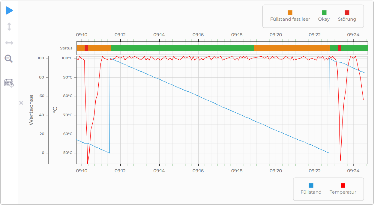
Visualization of temperature and fill levels in a Time Series Chart created with manubes
Manufacturing Dashboards
Various types of manufacturing dashboards are an important tool for production management and widely used in pretty much every industry. Dashboards provide a way to group selected information and give decision-makers a quick overview of the current production status.
Many manufacturers utilize both high-level dashboards covering the entire production as well as more specialized dashboards (e.g. for equipment performance, order status or energy consumption).
Dashboards can also include navigation elements and links to more detailed views, effectively serving as an entry point for deeper analysis.
Example: OEE Dashboard
Dashboards typically include key production metrics such as output and scrap/reject rates.
One of the most widely used metrics is the Overall Equipment Effectiveness (OEE), which measures equipment performance, both for individual machines and in aggregate.
OEE dashboards display values for critical assets side by side, making deviations easy to spot.
In the example below, users can switch between multiple production lines to quickly get an overview of performance.
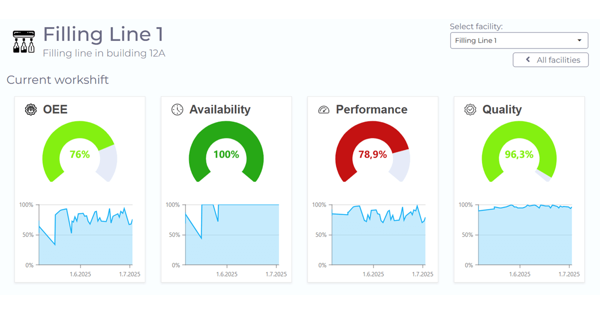
Example of a simple OEE dashboard created with manubes
Production Reports
Production reports include information on production results, resource utilization and deviations. They typically cover a specific time period and are used to evaluate production efficiency. A well-designed production report visualizes key metrics and KPIs in clear charts and tables, letting companies see trends at a glance.
The level of detail in a production report can vary. Some reports provide only a high-level summary of the most important metrics, while others may include the underlying data and detailed breakdowns.
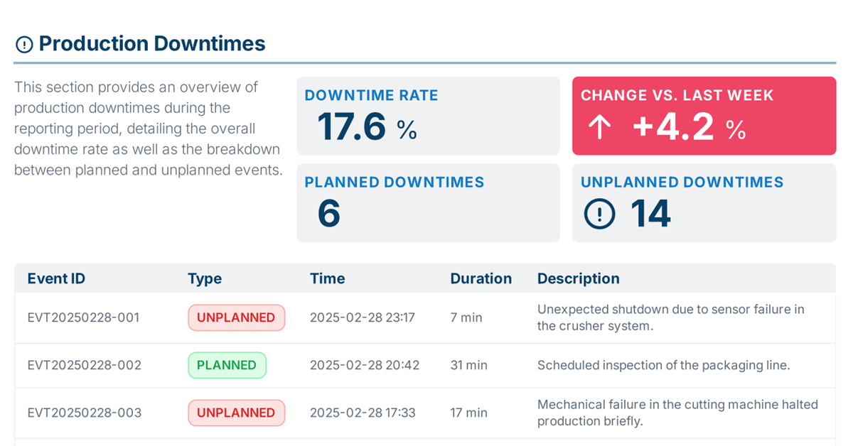
Report created with manubes that shows weekly production downtimes
Traditionally, production reports were created manually – a process that, from today’s perspective, had several drawbacks: Data had to be collected from different sources, was not always complete and manual entries often introduced errors.
Modern reporting solutions make this process far more efficient. With manubes, real-time data sources can be integrated directly into custom report templates, ensuring that the data is always up to date at the time of report creation. Report generation and distribution can also be automated which results in significant time savings.
Production reports complement dashboards by providing a more detailed and often more historical view of production performance. They are frequently used as a strategic foundation for decision-making, including in longer-term production optimization.
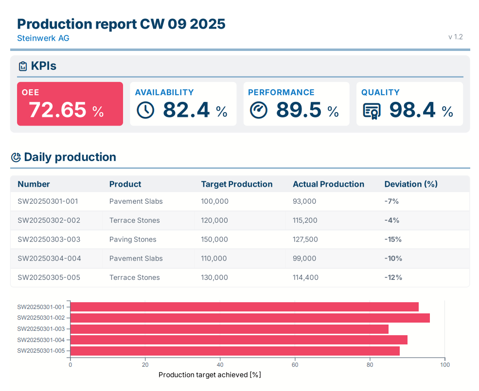
Part of a detailed OEE report created with manubes

Optimize your production with manubes
manubes offers a central platform for production data management, data visualization and workflow-based process automation.
Manufacturers gain access to a variety of innovative tools in order to quickly develop their own applications – tailored to their requirements.
Try manubes for free
Test the different manubes features in your personal cloud environment.
