Maximum transparency for production: manubes Release 1.5 focuses on data visualization and dashboard creation.
The new update expands the manubes platform with additional features for visualizing KPIs and status information, as well as options for quick and targeted configuration of charts and their underlying data sources.
The demo environment now contains a new OEE dashboard and an application for mobile push notifications. With a free test account, you can get full access to the new features.
New KPI Cards – Quick visualization of relevant metrics
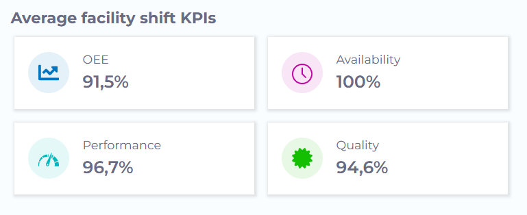
The new KPI Cards allow key production metrics and values to be visualized quickly, easily and effectively.
When needed, a KPI Card can display the absolute or percentage difference compared to previous values or time periods (e.g., +15% uptime compared to the previous day).
Color schemes and icons are fully customizable.
KPI Cards can be seamlessly integrated into production dashboards, ensuring that companies stay informed about the development of critical performance indicators at all times.

Freely configurable status indicators
The new Status Indicator element can be used to display the status of machines and equipment, as well as fill levels, temperatures and other condition-related information.
The element utulizes numerical status values that can be retrieved from controllers and other devices via interfaces like OPC UA. Users can configure the status display based on these values and define statuses and thresholds according to their needs.
Example 1: manubes can read status codes in real-time from a Programmable Logic Controller (PLC) that indicate the operating state of a machine (e.g., On/Off, Standby, Fault). These status codes can be assigned to corresponding conditions, which are then visualized within a manubes dashboard.
Example 2: A sensor provides real-time information about the fill level of a tank. With the new status indicator, manubes users can define the threshold at which the fill level should be displayed as critical.

Easier component configuration
manubes 1.5 simplifies the configuration of visualization elements such as charts and their underlying data sources.
With the new Guided Component Configuration feature, users are guided step by step through the setup of a chart, info card, or other element.
After selecting a data source, the data can be filtered, sorted, or aggregated to create the ideal chart in just a few steps.
Example use cases:
- Displaying total daily downtime in a bar chart
- Pie chart showing production volumes, filtered by machine
Try manubes for free
Try the different manubes features within your personal test environment.
Our team is happy to assist you with any questions.


Recent Comments